Design Challenge
The Gypsy Circus Barrelhouse brewery website has many issues with the usability, such as their unmotivating and their unclear design language.
My main goal was to improve the usability of the brewery's website to make it easier for customers to find what they needed while cutting down and reorganizing the links on the main menu.


The Solution
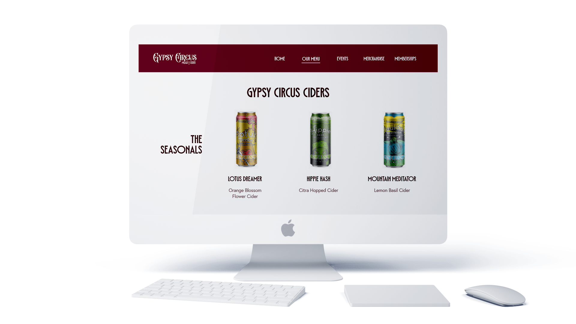
I solved the problems in a more design-focused manner. After conducting some research, I considered these main components which made for a negative user experience which were complicated user flow and lacking design consistency. Shown here is an example of just that, the images for the ciders were out of proportion to the screen making it more work for customers to see the full image an description.

Visual Design
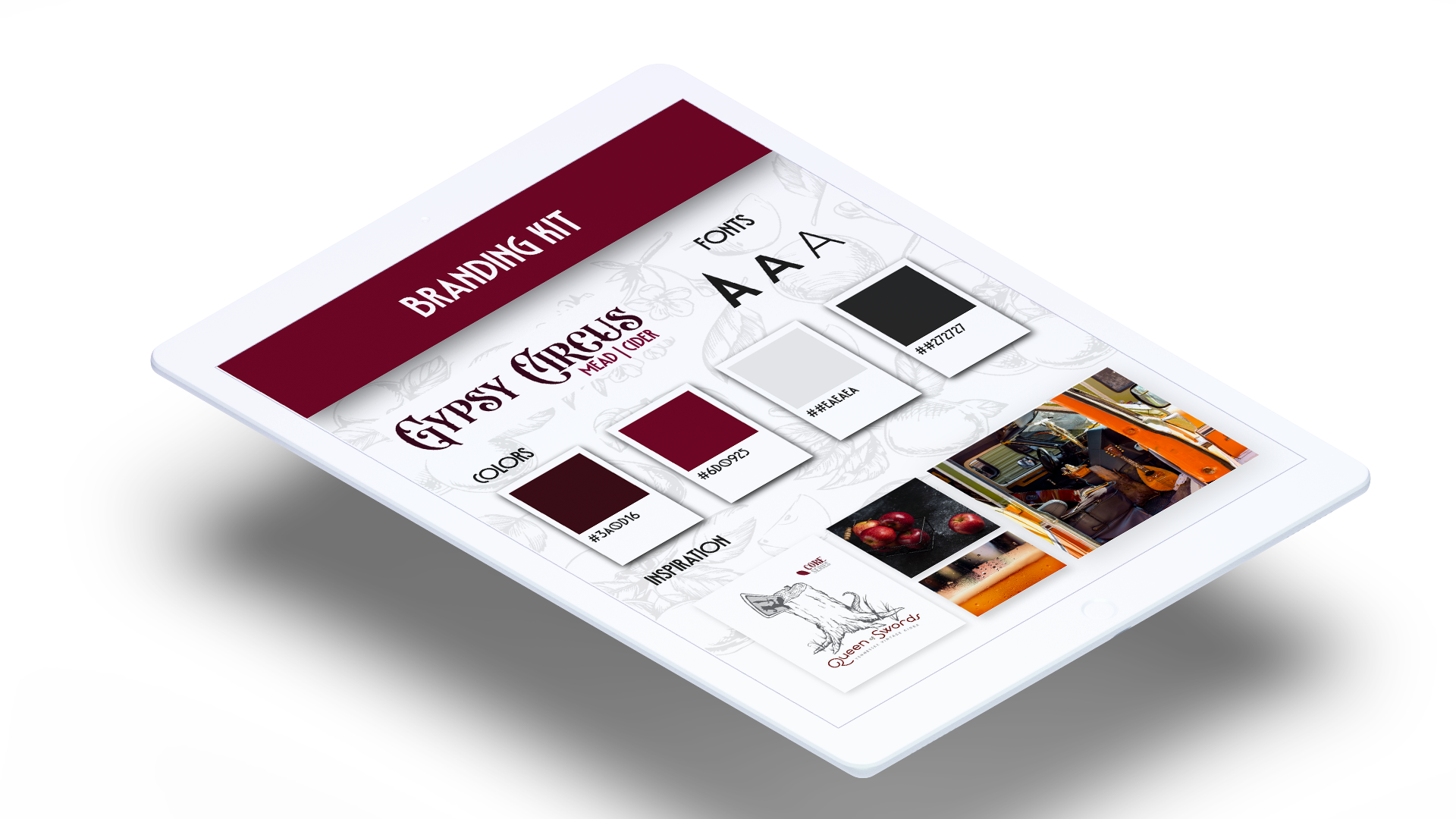
I created a brand identity for the company, keeping true to their colors, history, and characteristics that I found during my research. I wanted to create strong contrast and hierarchy through out the website to make it easier for customers to find what they need.

User Flow
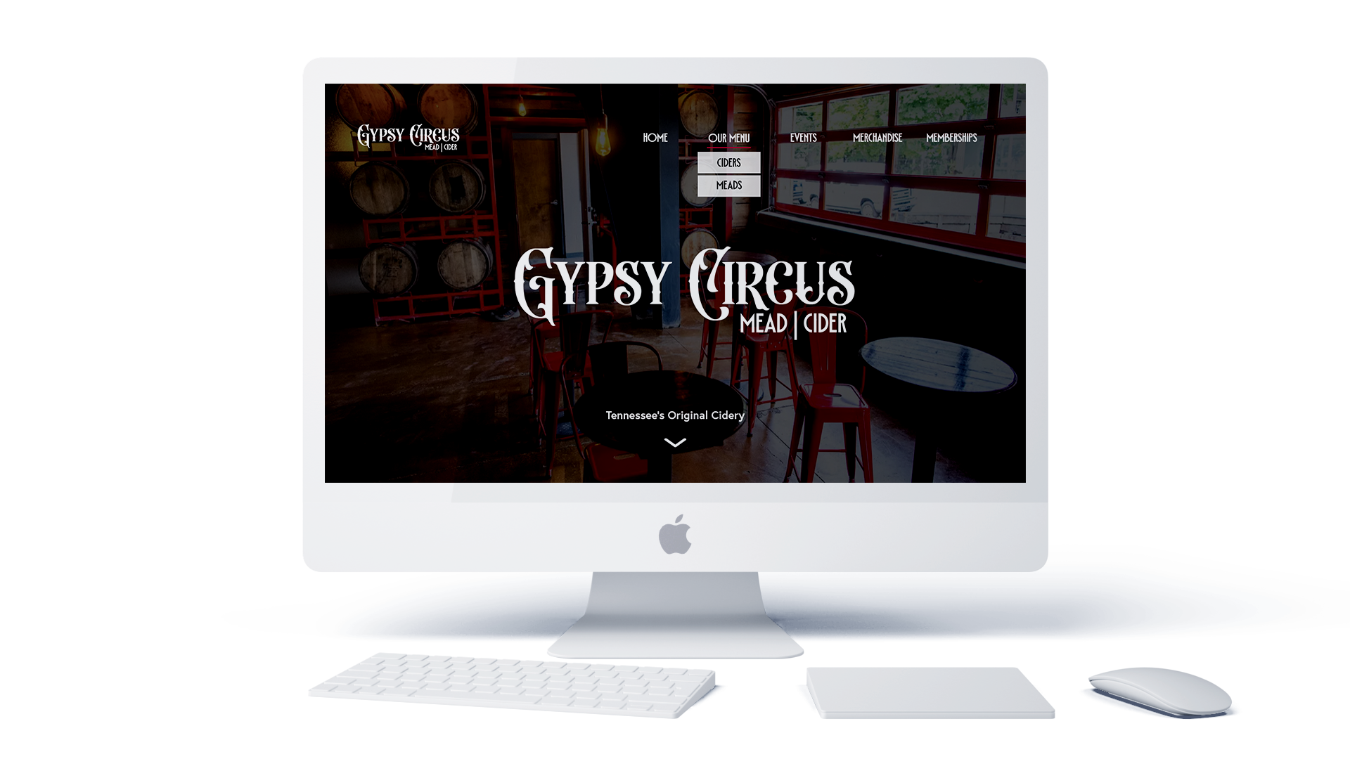
I solved the problem in a more design-focused manner. I began by shortening the flow from 10 links at the top of the homepage to 5 main links on the main menu, including submenus.

Final Design
I created a brand identity for the company, keeping true to their colors, history, and character that I found during my research.