Design Challenge
The Mexico Lindo website has many issues with the usability, such as their unmotivating design language.
My main goal was to improve the usability of the brewery's website to make it easier for customers to find what they needed while cutting down and reorganizing the links on the main menu.


The Solution
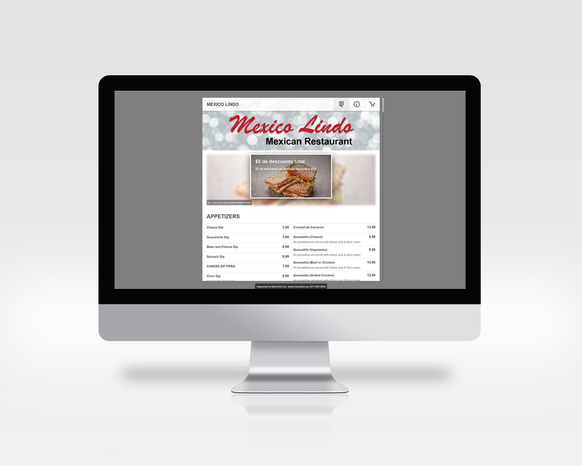
Shown here is an example of the plain design. They have a page for their menu, contact information, and the cart

Visual Design
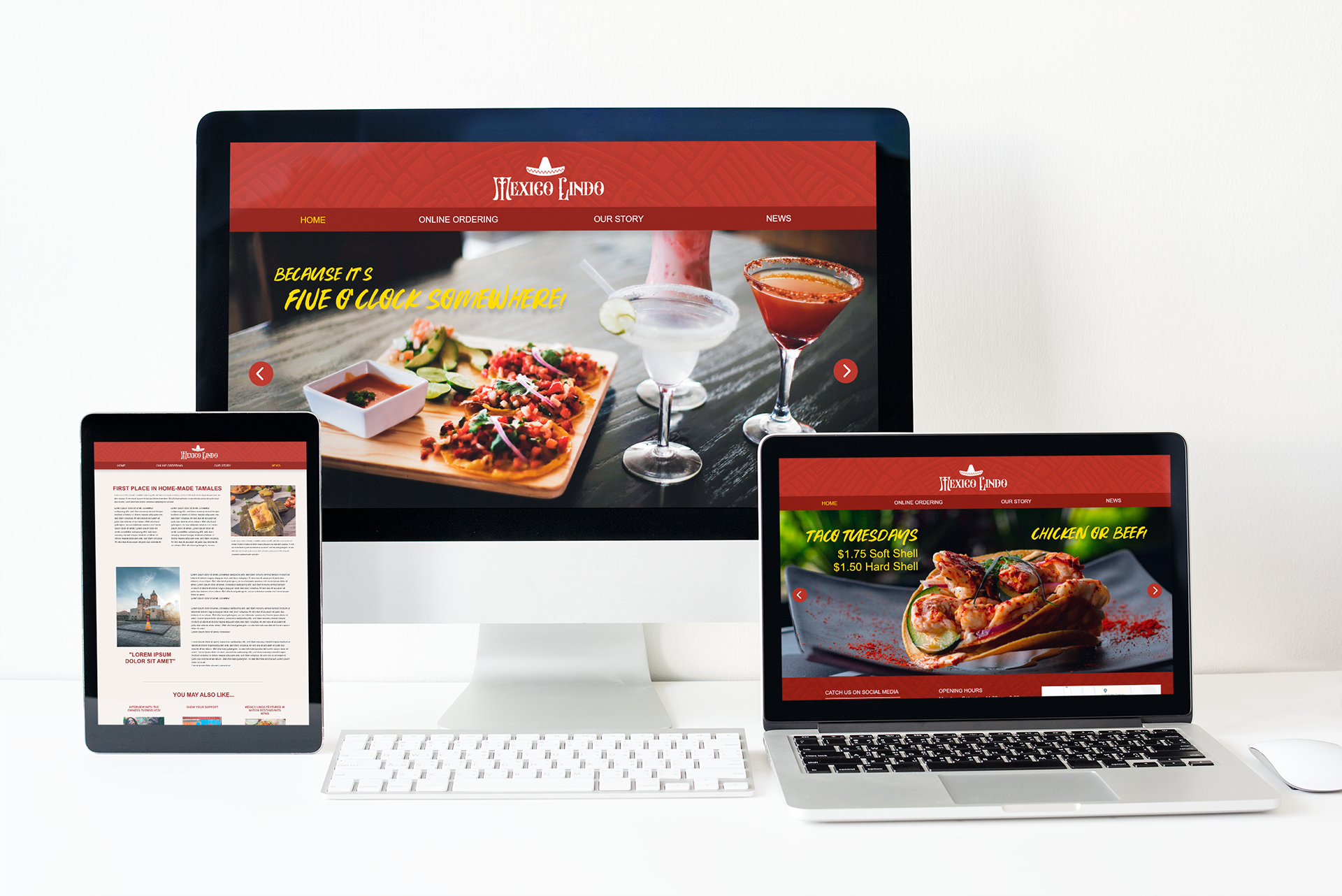
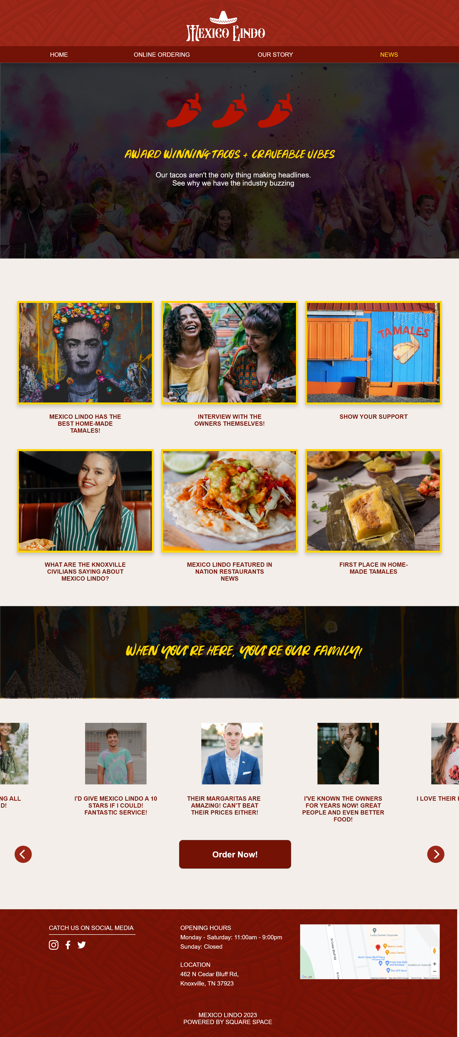
I created a brand identity for the company. Doing my research I couldn't quite pinpoint a a specific color palette, so I developed one for them. My main inspiration for the colors that were used is what Mexico's culture is very well-known for, their bright and vivid color palette.

User Flow
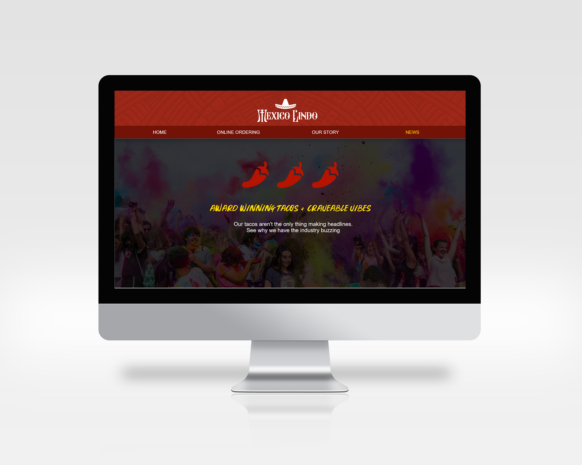
I solved the problem in a more design-focused manner. I began by adding a home that includes specials they may have going on at the moment, an online ordering options, a page to tell their story, and I've also added a news page to keep customers up-to-date on the the restaurant.

Final Design
I wanted the final design to have bright colors that blended well together. I also wanted the website to look higher end. This is the final result!